
Team - Creative Hub, Inter IKEA, ACNE, TWNKLS
Role - UX lead and responsible for stakeholder management, concept creation, mobile, desktop and Apple TV wireframing, content alignment, testing and global market follow up
Objective - Don't create PDF. Joking, not joking.
"The catalogue is bigger than the bible"
The catalogue within IKEA is sacred. Popular opinion does not like change especially regarding a an institution like the IKEA catalogue. That's why suggesting any updates to it must be done with a certain diplomacy.
The basic approach to this project was creating an experience that enhanced the catalogue content being created for the print version and still be relevant globally but didn't mirror IKEA.com. Trying, failing iterating would be key.
Tone of Interaction
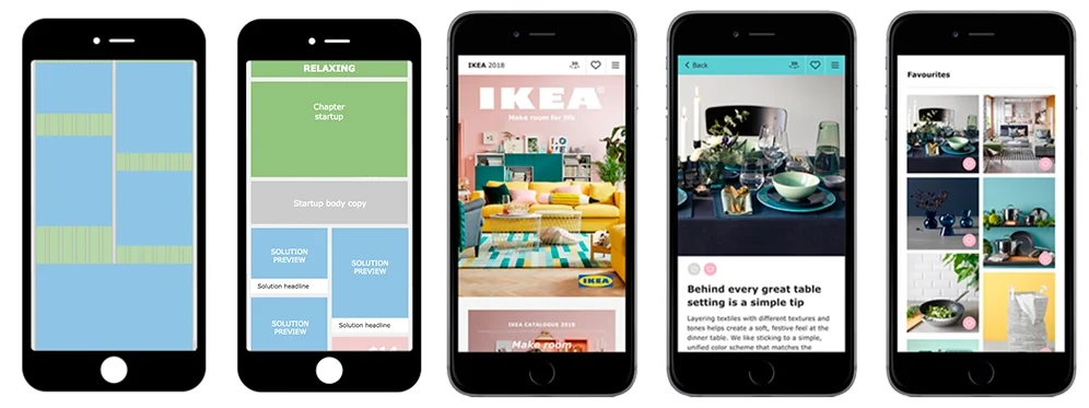
To start, we created a document called the Tone of Interaction. Since content was being created in parallel to the design of the online experience, we had to create some guidelines to give to the content team and stakeholders to make sure the content would work within the design. This included (not full document):
Decorative elements
Breaking the grid
A "deep shallow" experience
Test. Test. Then, test again
It was important to get critical feedback before launch to test and iterate on the design. We did some preliminary testing with a small test group. Considering content was still a work in progress, we focused the testing on the following points.
Chapter Startups
Colors
Navigation including filters, burger menu, dots navigation
Copy Headlines
Intro copy
Quick solution
Button sizes
Images
Task completion
Links to IKEA.com
Onboarding intro text and imagery/animations
Another conscious decision made was to leave the testing open to allow for initial and "honest" reactions. Here's the feedback that was incorporated into final design
Navigation was easy and simple to use i.e. color
“(The IKEA Catalogue) should find me”
Focus on the HTML experience not an app
Main source of inspiration
Too much text and confusing headlines
More interactive content
Buying isn't a top a priority